German Online Institute
Client
GOI – is a non-state educational project that offers remote German language courses under the CEFR standards. The service is provided in the form of online interaction between students and teachers. GOI specialists develop individual educational programs and assist the process of individual education via Skype.

Main Aims of the project
To design business ID guidelines for the GOI project (logo, corporate identity, corporate fonts and colors). To make the project easily recognizable and memorable. To develop a modern and reliable, original and user-friendly corporate website which will serve as the platform for effective collaboration with potential customers.
OUR INTENTION
- • To design the corporate logo.
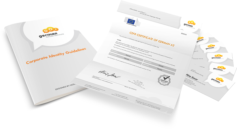
- • To draw up the corporate identity guidelines that confirm approved color palettes, typefaces, page layouts and contains information how these rules must be applied.
- • Mockup design for the future site pages, further coding and functional development.
- • Complete testing of the site, launch checklist and going live.
- • Initial support for the customer.
THE RESULT
User-friendly bilingual corporate website, modern, attractive and original, with easy navigation. For sure this site will contribute to the effective promotion of the GOI educational project in the market. That is supposed to mean that our work is 100% done.
THE LIST OF PERFORMED TASKS
To achieve the goal we singled out 5 main steps:
- Corporate logo design on the basis of already existing files. Corporate titles and set of guidelines development.
- The mockup design and further coding in accordance with modern standards of usability and adaptability.
- HTML5 / CSS 3 coding.
- Additional functional development. Integration with content management system WordPress.
- Going live.
THE PROGRESS
1. At the first stage, we have prepared a couple of logo concepts. Later, one of them was approved by the client. The approved logo served as the basis for creating GOI business ID guidelines. Blue and orange colors were taken as the basis for the corporate palette. Each of them is “symbolic”. Blue color emphasizes the use of the Skype service while orange color perfectly matches the blue and creates some contrast needed to attract and hold the visitors attention. The milestone product of this stage is the logo presented in a wide variety of formats including ready-to-print formats.

2. At the second stage, we designed mockups for the home page and other unique pages. Also, we designed banners. The milestone product of this stage is the approved pages design in PSD / JPG formats.
3. During this stage, we did HTML / CSS adaptive coding of all the approved pages. As more and more people prefer to use mobile devices to surf the net on the go we optimized it for smartphones and tablet computers.

4. During the design stage, we performed the site integration with CMS WordPress. This CMS is characterized by convenience and simplicity. Many different plug-ins and templates availability made us to choose WordPress. As well as having the glory of one of the easiest to handle with content management system. Also, we integrated facebook feedback form which automatically displays and updates only comments estimated as 5 stars.
5. At the final stage, we performed SEO optimization (XML sitemap, robot.txt file) and installed Google analytics tool. It helped to achieve search engines proper indexing. Furthermore, we did the site system testing. That helped to reach cross browser compatibility, mobile devices adaptability. Moreover, we recorded training videos for the client to teach him how to manage the site himself and to independently perform common tasks (to load news, to change images, etc.) on his own.
Development team
Konstantin Davydov – design, theme customization.
Sergey Pischanetskiy – WordPress development.
Alex Shalyonny – project management.
You can meet us at our site.
Technology
Adobe Photoshop CC
HTML5 / CSS3 / Javascript
PHP5 / MySQL
WordPress CMS
