Urban Advantage
Client
American Museum of Natural History (AMNH) – one of the largest museums in the world, has employed DesignRussia to update and finalize its partnership programme brand identity. The Urban Advantage project was created through a collaboration between 8 largest cultural institutions where teachers, students, and their families investigate and understand science together.
STARTING POINT
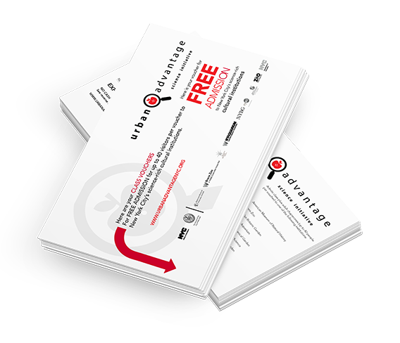
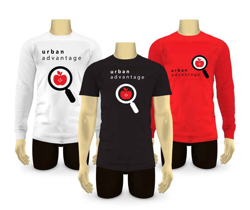
Urban Advantage educational initiative started in 2004, and by 2017 has certainly obtained its own distinctive logo, colours and identity elements. The latter were perfectly displayed on their site https://www.urbanadvantagenyc.org, its banners, posters, souvenirs, T-shirts, admission vouchers, etc.
However, when DesignRussia began to work on a new UA site design, we faced an inconsistency in most of the branding materials, which deprived UA brand of elegance and neatness.
The existing UA apple-in-the-magnifying-glass brand symbol already had a rich connotational background. Thuswise, we decided against complete and drastic rebranding of the UA logo.
GOAL
Our goal was to reach gracefulness and clarity of the UA brand that would attract new students, teachers, schools, and other institutions. We wanted to adjust to a common basis all the existing UA logo versions, create a unique corporate identity guideline and apply UA brand guideline rules to the existing UA corporate materials.
PROGRESS
Refreshing a logo has never been a trivial part of the designer’s job. In terms of tact and technique, this kind of design may fairly be compared to facial surgery.
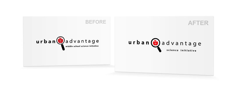
Looking at the existing UA symbol we saw a strangely shaped apple, heavy and extra-elongated handle of the magnifying glass, and certain disproportions in the primary and secondary phrases and the symbol arrangement.
Four alternative versions of the updated logo were introduced to the client, ranging from more traditional to utmostly symbolic. UA team however decided to stick closer to their original logo.
After a series of revisions we came up with the final logo, which was approved by the client and included into the brandbook.
After that we updated all the client’s printing materials and prepared them in .PDF, .ai and .indd formats. A UA staff business card design was created to fill in the gap in the corporate style.

Finally we put all the rules and corporate id examples in the brand guideline. It has a common structure including overviews, specifications, colour palette, typography, colour configurations, application and incorrect usage. It serves as an official document, however is not too strict and thus its rules can easily be followed.

ACHIEVED RESULT
We created a distinct, legible logo, and an official brand guideline, which reveals UA Team corporate personality. The brand guideline displays clear lines, consistent fonts, measured proportions of UA logo…and Urban Advantage itself revealed in a stylish identity!
Development team
Konstantin Davydov – brand revisions, logo redesign and brand guideline layout.
Maria Tkachenko – project management.
Alex Shalyonny – general supervision.
You can meet us at our site.
Technology
Adobe Photoshop CC, Adobe Illustrator CC